Most games and apps optimise their onboarding for completion, rather than for comprehension. Which means that while the metrics dashboard reports another user cleanly onboarded, the reality is that the user on the other end may not have quite the level of understanding the system thinks they do.
We all know the feeling. You download a new mobile game, boot it up for the first time, and get dropped into a highly-optimised process designed to get you to grips with the product. 'Tap here!', it says, a Big Red Arrow showing you where. 'Now open this menu, and tap this!' You do. You're following instructions, tiny dopamine hit every time you do what the system tells you, and the system's feeling good about itself because you're hitting the right thing at the right time.
And then you reach the end of it, the signposting disappears, and maybe you're not entirely sure what does what.
Completion ≠ comprehension.
It's a difficult one to argue against, because stepwise movement through an onboarding process is easy to track. Designers can build user flows that make it near-impossible to miss the next step, and on the analytics dashboard, the team sees very little drop-off between start and finish. The metrics look good. The metrics are also measuring the wrong thing.
A user that gets to the end of onboarding isn't necessarily someone that understands what just happened.
Doing Isn't Understanding
Here's a tangible example of what I'm talking about. Metroid Dread. I was maybe half an hour in when the game taught me a new missile-based attack I'd just unlocked. Safe environment, no pressure: press this, hold this, tap that. I did. Missiles fired. Player succeeded. Happy days, we're done.
Fast forward a couple of minutes. New enemy, requires the attack I'd just learned. Hold... what? This? Nope. That? Maybe. Then tap th- oh. Dead.
I gave it another go, failed, then quit right there and haven't booted it up since.
The system assumed that because I'd performed the action once – in an unthreatening space, under zero pressure – the job was done.
Reader, the job was not done.
Designing For Comprehension
If the metrics are measuring the wrong thing, the problem on top of the problem is: how do you optimise for comprehension rather than completion?
I'm genuinely not sure a convenient set of metrics exists for this. But I gave it a good crack with Threkka.
To set the scene: Threkka's a fitness game for iPhone. I built it to help people build healthy habits. At a very simple level, it uses HealthKit to determine when a Player has exercised, and uses that to power in-game systems.
An important part of Threkka's design philosophy is that everything is rooted in the game's fiction. I bent that rule ever-so-slightly for onboarding, but not by much – we'll come to that in a sec. The general philosophy was that everything is set within, supported by, and helps to support, the idea that a version of you has found themselves in a parallel universe called Liminalia. The Player has two primary ways of interacting with the game world:
- Drag and Drop (which, true to form, is wrapped up in the fiction: according to legend, humans in Liminalia bring with them the power of Dragon Drop)
- the in-game Player's in-game mobile phone – a system called fitOS
Essentially, if I can get Players to a point where they understand that tapping things, dragging things onto other things, and fitOS are the main ways to interact with the game world, they're basically all set. Anything they need to do or learn, they can do.
A Safe Space To Experiment
So, the Player boots up the game. After they've done the initial legal screens, mindful that what follows is quite a long way from established best practice, I tell them this:
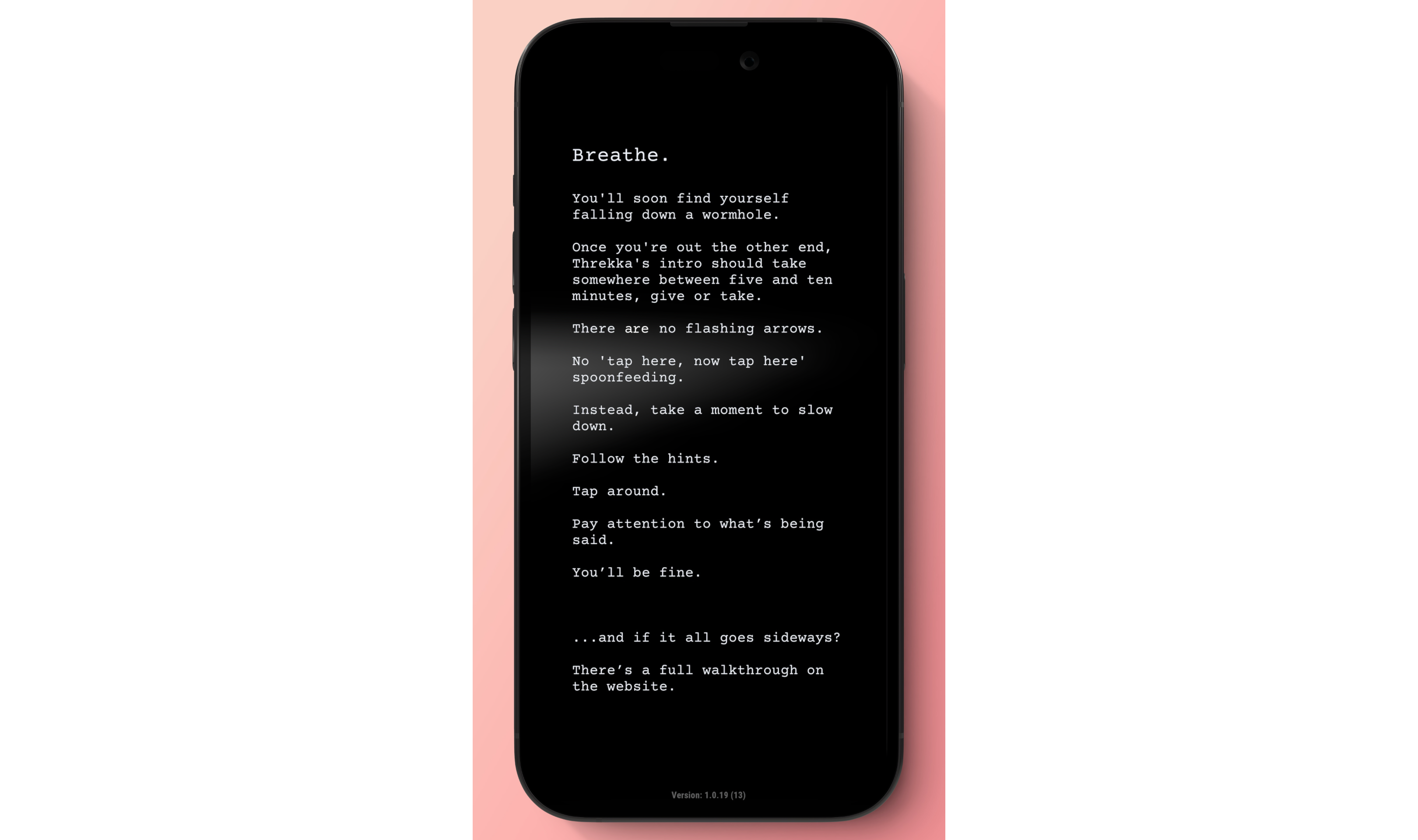
Slow down, follow the hints, tap around. You'll be fine. And if it all goes sideways, there's a walkthrough on the website.
Next up, they read a bit of story, and find a past version of themselves tumbling down a wormhole. They do some customisation to make their 'them' look more like them, and then the Player's presented with their first look at Liminalia:
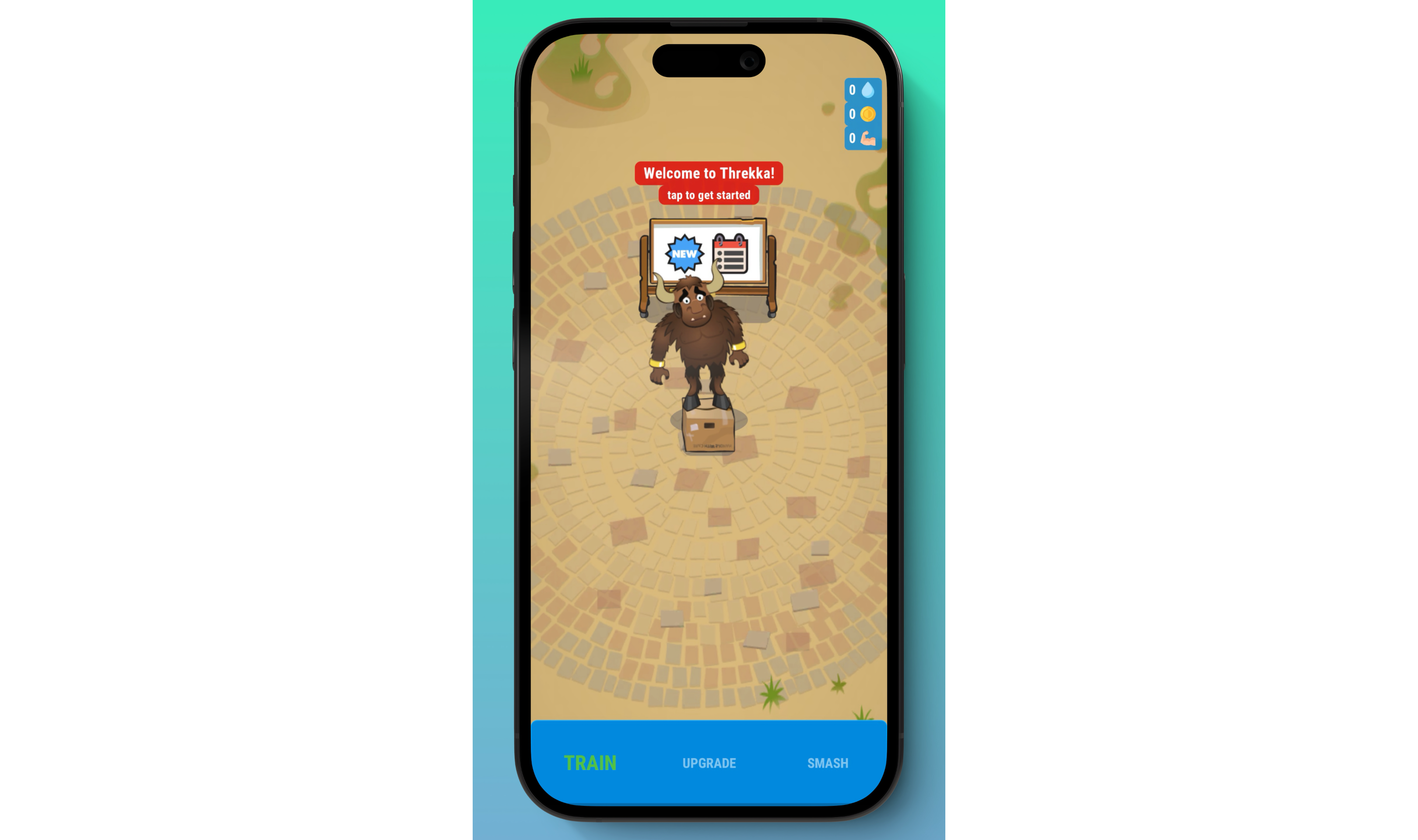
There's a minotaur stuck on a box. Not something you see every day. The character the Player just made isn't visible, but there's on-screen text (which is the one small rule-bending I mentioned earlier): 'Welcome to Threkka! Tap to get started'. This step is basically waiting for the Player to signal that they're ready. Tap, and...
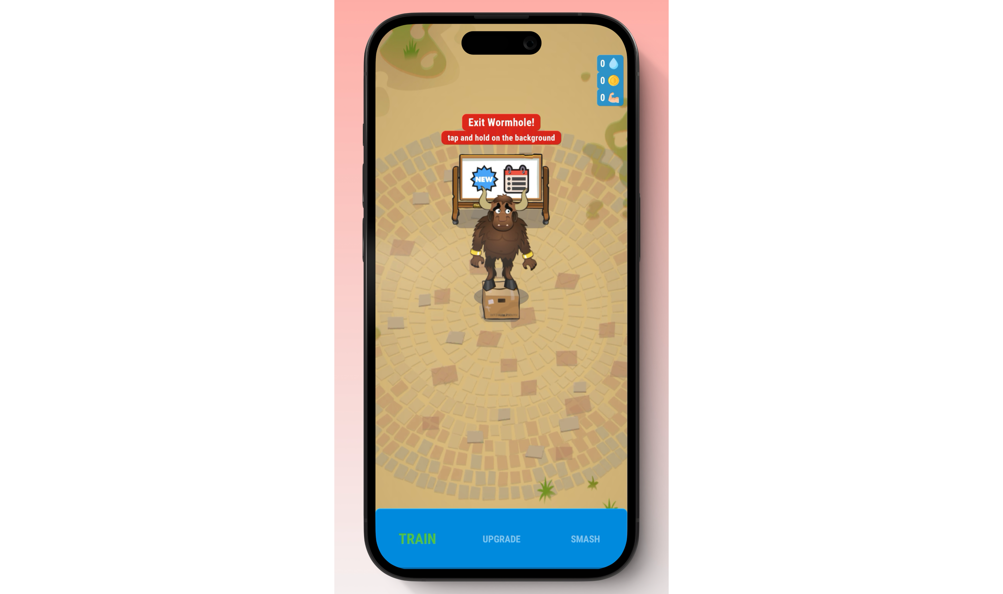
...the text changes. The Player's asked to tap and hold on the screen to 'beam in'. They do that, and the next stage unlocks. And this is an important one, because tapping characters – I call the Champs – to see what they say is an important hint system for the rest of the tutorial. Here's what the Player Champ – says:
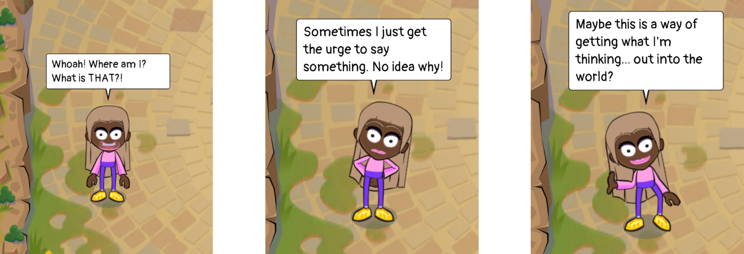
This is the hint system teaching itself: tap the Champs, and you'll hear what they've got to say. Throughout the rest of onboarding, tapping on a Champ – one, twice, three times – gives more and more detailed hints about what the Player should do, culminating in something along the lines of "if this were a mobile game I was playing back home, I'd try doing [x, then y]."
Then the Player is introduced to Dragon Drop for the first time – they drag and drop the minotaur off the box, and then next, the Player Champ onto the minotaur to kick off a conversation.
At no point are there obvious flashing arrows; the entire experience has been designed as a safe space to experiment in (Dragon Dropping incorrectly results in one of the characters speaking hint text), with no 'wrong' moves.
And I realise, absolutely, that not having 'an obvious thing to do next' – courtesy of No Big Red Arrows – is a risk. And I know that some people take some time to figure out the next step. And they might get a little frustrated. But my rationale is: if they manage to work it out for themselves, then the action they took to get the result they're wanting is much more likely to stick.
So: whether Players 'get it' instantly, or not, or take a little time working out the precise expectations, or not, once they get to the end of onboarding, they will know precisely the three key things that enable them to play Threkka.
Now, I do have metrics that trigger at the end of each onboarding stage – the idea being that, over time, if a big number is followed by a small number, something about that step isn't clicking. But even those are in service of comprehension, not completion.
The Risk Worth Taking
It's important to say that Threkka didn't get anywhere near enough downloads – and therefore feedback – for me to know whether I approached this correctly or not. An onboarding that welcomes confusion, is structured for safe experimentation, and doesn't mind if people get stuck for a while, is certainly a risk.
But it's worth sitting with if you're designing onboarding for anything. What are your drop-off metrics actually telling you? That people got through – or that they understood? Measuring for – and designing for – completion? That's easy. Comprehension is harder to measure, which is probably exactly why people seldom design for it. If your dashboard is set up to measure the wrong thing, the wrong thing is what gets built. You get the behaviour you design for.
From the point of view of the human-centred and Eikkien way that I design, the risk is well worth taking. Threkka's onboarding unapologetically exists to support its Players on a journey to understanding how to play the game – not just how to complete its onboarding.